

Klub Młodego Odkrywcy / Young Explorer’s Clubs
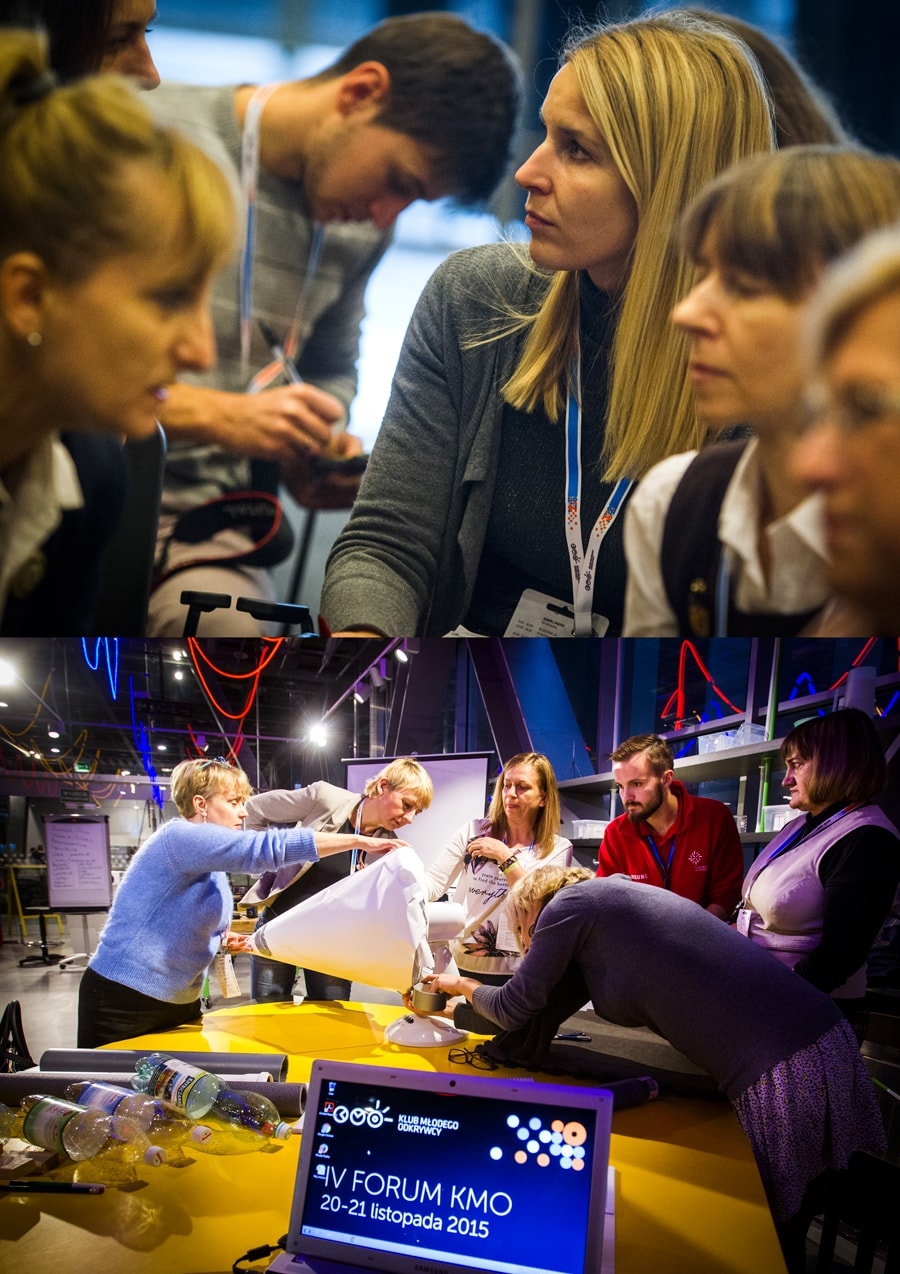
The Copernicus Science Centre has a nationwide network of school clubs called Young Explorer Clubs.
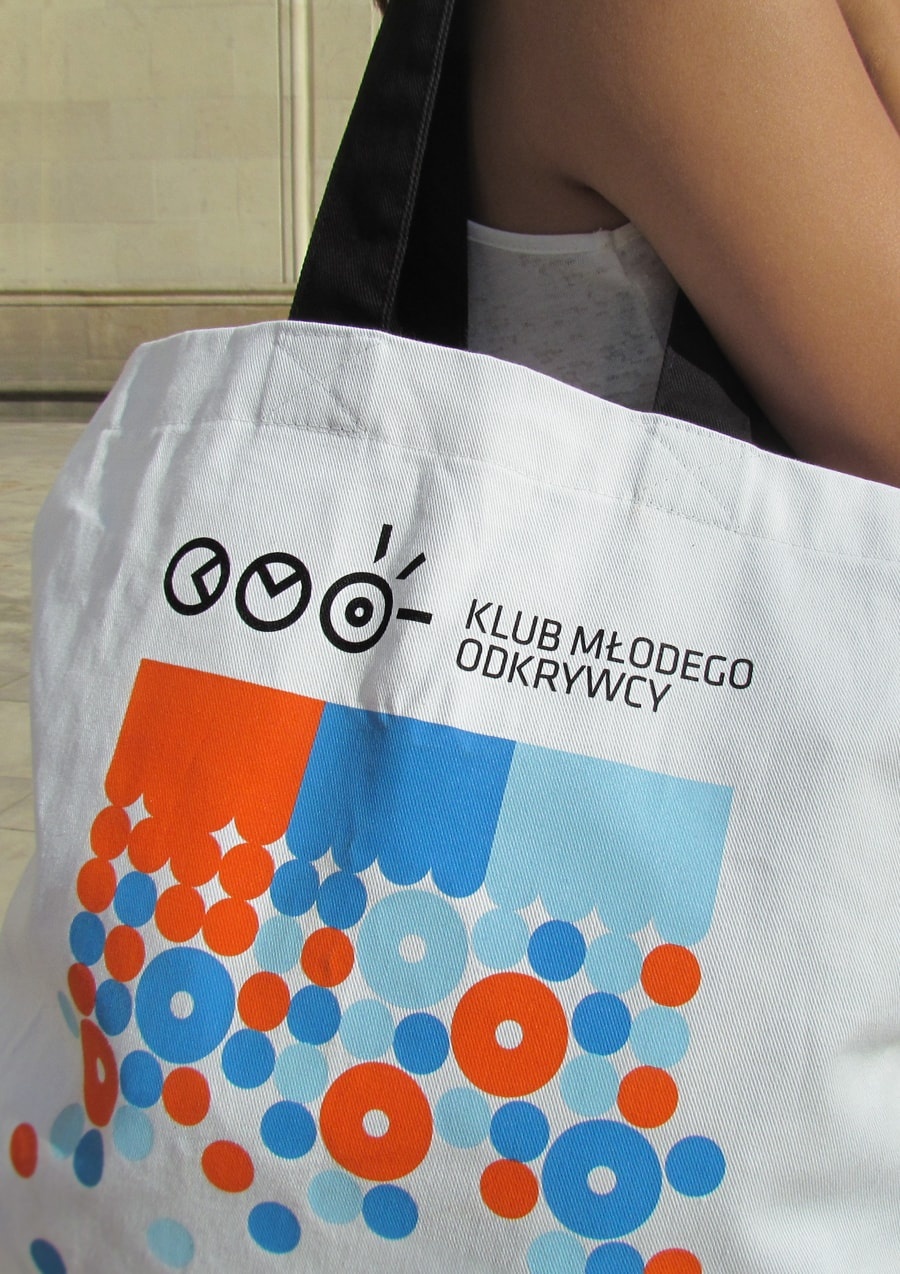
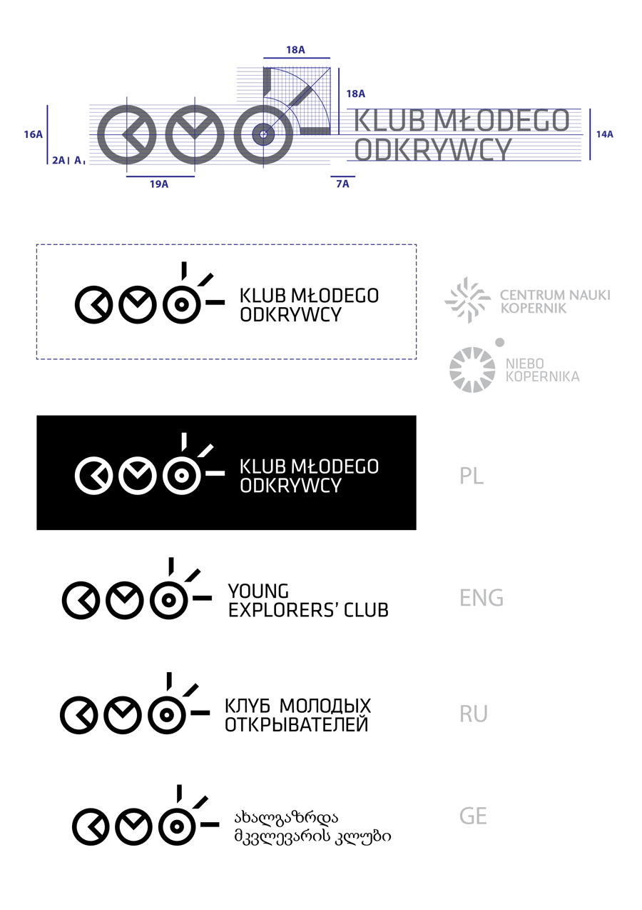
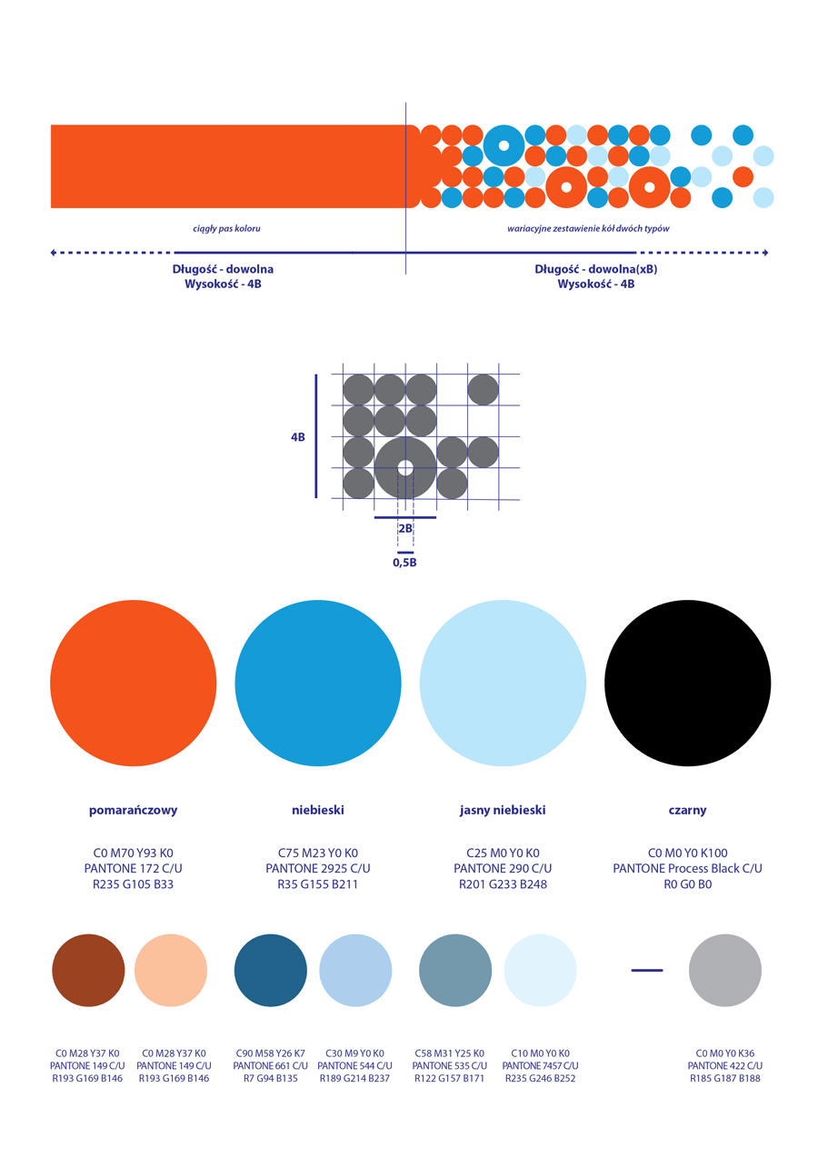
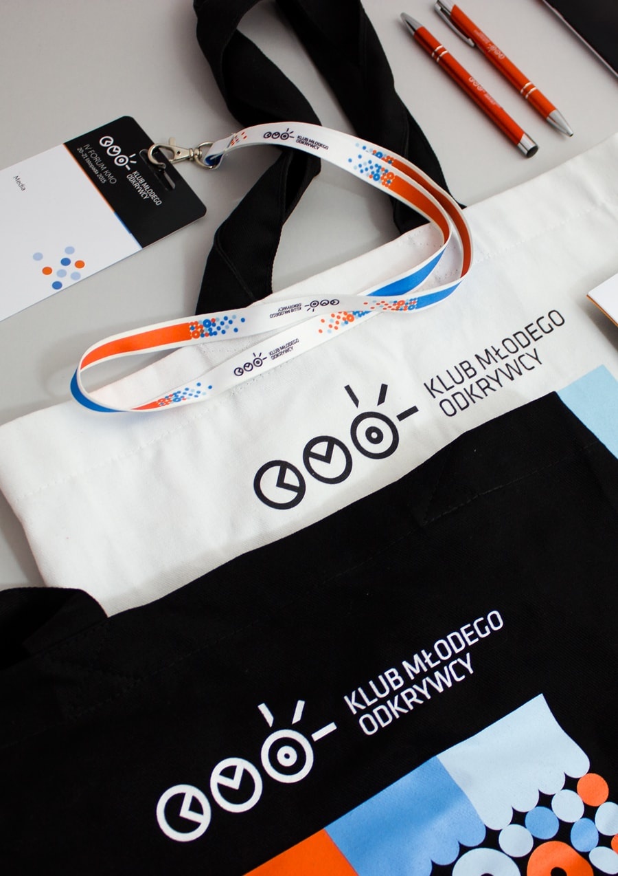
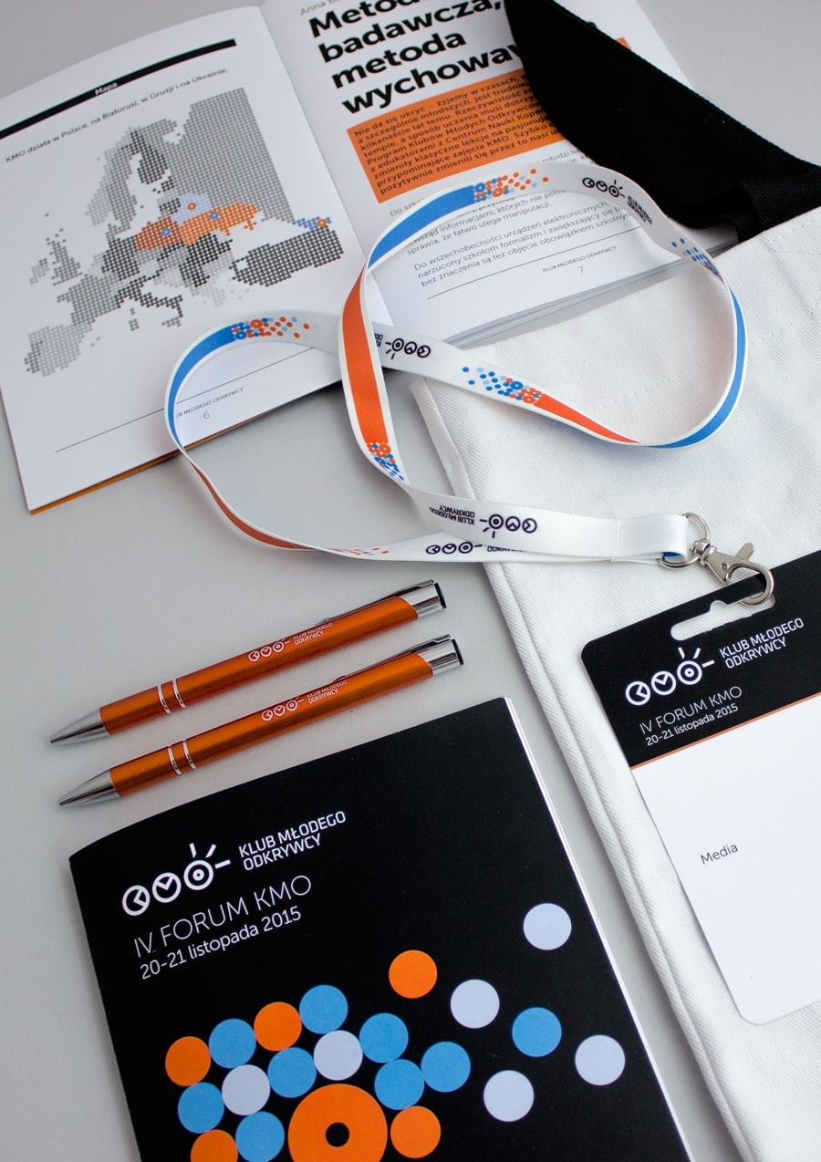
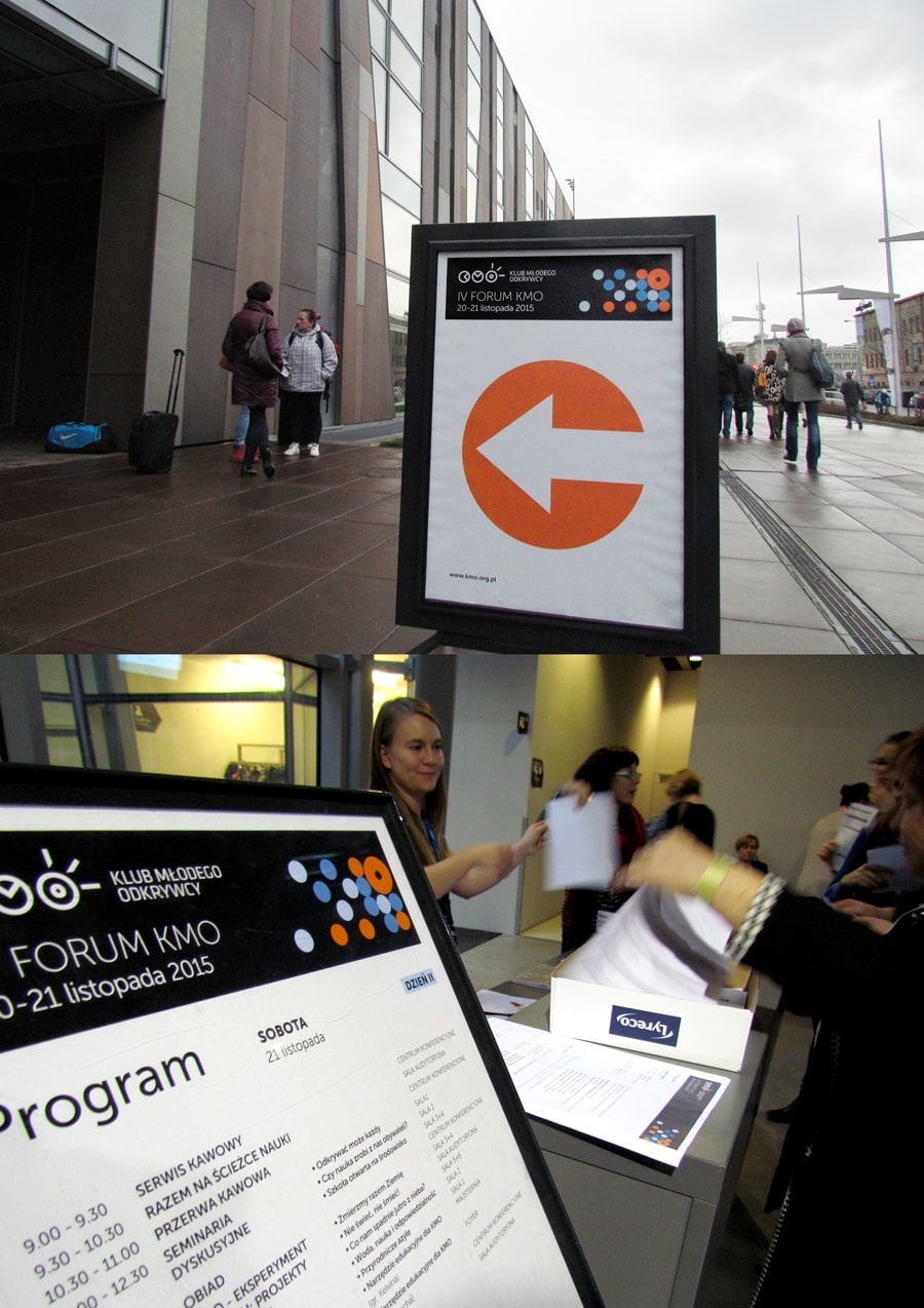
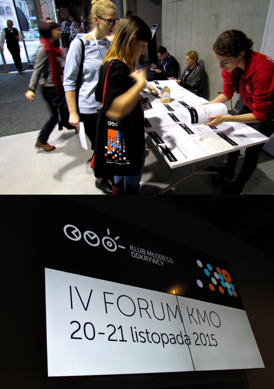
The new graphic identity of the Clubs had to match that of its parent institution. Next to obvious typographic references, it was also necessary to adapt the horizontally placed abbreviation “KMO” (short for Young Explorer’s Club in Polish) to Copernicus’ signet ring with a central abstract pattern. Due to the Centre’s international partnerships, the new logo had to be designed in many languages and alphabetic versions (e.g. English, Russian or Georgian). The visual content of the new branding is based on the water-fire contrasting colours and opposition of forms achieved either through atomization or merging. A play of these simple symbols provided for modules which may be further freely rearranged and customized for various graphic products. The symbols were used which clearly refer to the core activity of the Clubs: learning through chemical and physical experiments.
